
INDUSTRY
WHAT WE DID
PLATFORM
simple grow
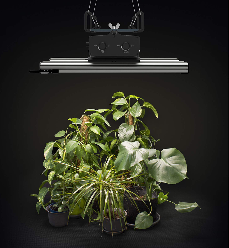
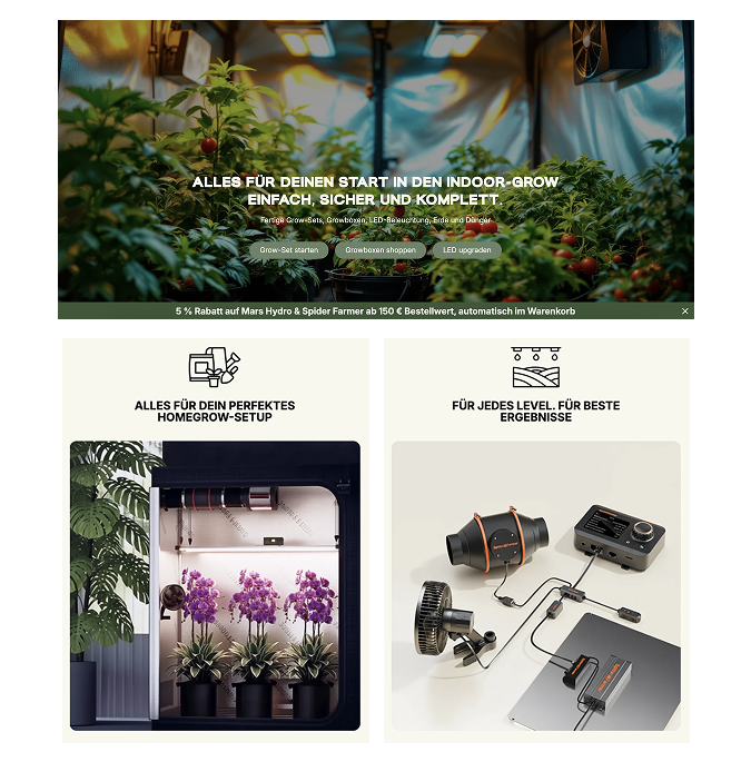
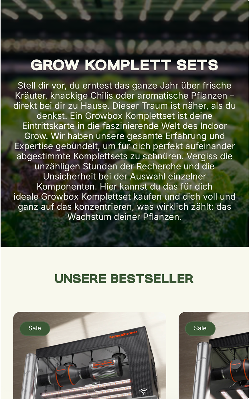
Simple Grow is a Germany-based ecommerce brand helping hobbyists and home growers build better indoor growing environments through LED grow lights,
grow tents, ventilation systems, complete kits, and educational resources.
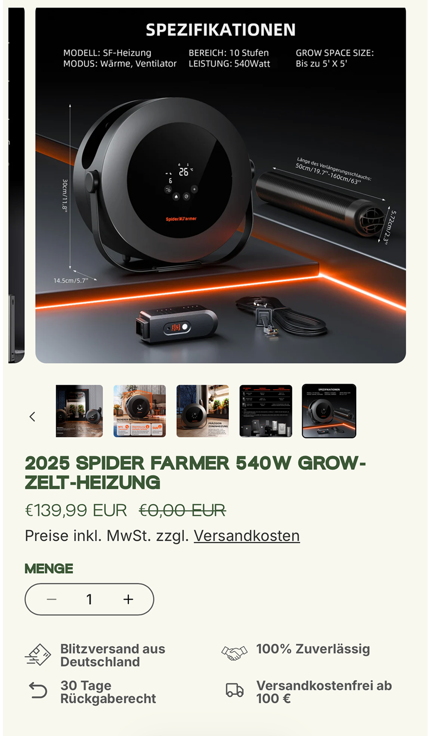
The category itself is highly technical. Customers are often comparing wattages, coverage areas, grow stages, component compatibility, and long-term operating
costs before making a purchase.
The challenge
Key challenges
Our goal
our approach
-

LANDING PAGE
-

MOBILE SCREENS


Discovery to Architecture


Design to Build

OPTIMISED FOR
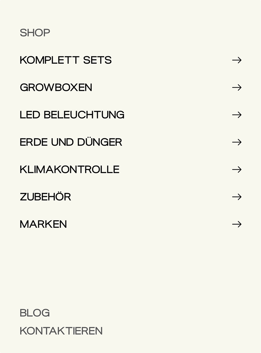
Clear visual hierarchy
RESULT SUmmary
90 DAYAUDIT
TEN TIMES THE BUYERS, FROM THE SAME STORE.
€67,724
TOTAL SALES OVER THE WINDOW
Held steady (+0.9%) against a strong prior holiday quarter — while orders multiplied and the buyer base widened. Average order value settled at €187.72.
80%
OF ALL SESSIONS CAME FROM MOBILE — 17,200 VISITS, UP +723%.
Top cities
Top products
see more of how we build
-
 Sold out
Sac-Cabine is a French travel-gear brand built around a single promise: help people travel lighter while saving money on luggage fees. Their signature vacuum-compression backpacks allow travellers ...
SAC-CABINESold out Sold out
FeelRooty is a next-generation wellness brand creating mushroom-based adaptogenic beverages designed for focus, energy, and long-term well-being. Their visual identity is bold, organic, and storyte...
Feel rootySold out Sold out
Camile & Stone is a fast-growing contemporary jewellery brand offering premium 18k vermeil and moissanite pieces without the luxury markup. With over 350,000+ happy customers, the brand is buil...
camille & stoneSold out Sold out
Energy Bytes creates The World's Most Delicious & Effective Energy Gummies. They’re a dynamic young and fresh vitamin brand, popular among people with a high performance lifestyle.
Energy BytesSold out Sold out
Mille is a slow, tender, family-first knitwear brand built around one idea: warmth is an emotion you can wear. Every piece from tiny cardigans to hand-knitted balaclavas is crafted in small batches...
MilleSold out Sold out
KOA Life is a fast-growing peptide skincare brand built by two founders who spent years navigating adult acne, inflammation, hormonal imbalances, and ineffective routines. Their formulations are ro...
KOA LIFESold out Sold out
Betro Simone is a Los Angeles–based womenswear brand rooted in everyday luxury: denim, knits, loungewear, and seasonless essentials crafted with restraint and intention.The brand is positioned betw...
Betro SimonSold out Sold out
Morning Glory is a Polish wellness brand that invites people to begin their day gently. Their blends from vegan collagen boosters to superfood mixes are created to be simple, natural, and joyful ad...
MORNING GLORYSold out Sold out
Ripple+ is a next-gen wellness brand redefining aroma experiences with plant-powered diffusers that are 100% nicotine-free.Founded in 2019 in a Camden garage by Sam Lucie, the brand has grown into...
RippleSold outTAKE A LOOK AT OUR SERVICES
-

Step 1
launch fast
OUR LAUNCH SERVICESGet your Shopify store live in record time, without compromise.
-

-


